![]()
This template needs Ensign Version Aug 28 or later.
When applied to a $Tick chart it will print the current tick value in the chart’s “section” row at the bottom of the chart. When user-defined key tick levels are met, it will change the color to green or red as appropriate.
In the example provided, the section row will print red when the tick is < 0 and when it goes to 1000+. It will print green when the tick is >= 0 and when it is < -600.
So when the tick is > 0 you get a green print of the changing tick values
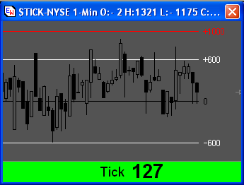
but when it goes beyond 1000 it will print red
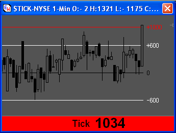
until it goes back below 1000, giving the “flash” effect . A similar effect occurs when tick goes below 0 and below -600.
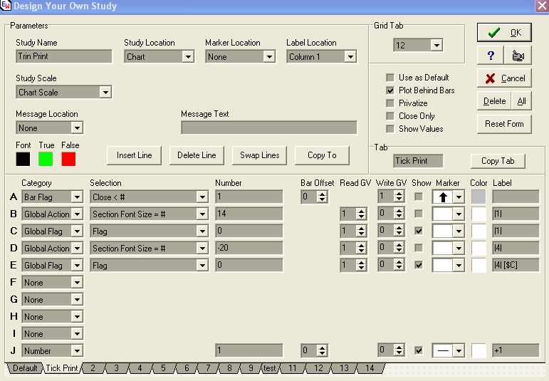
In prior versions of Ensign to ensure that the whole of the chart’s section row printed all the same color, you had to use 6 or 7 dyos, each with similar logic to print the same color in each of the sections. With recent enhancements you can now accomplish the same effect with just 1 dyo.
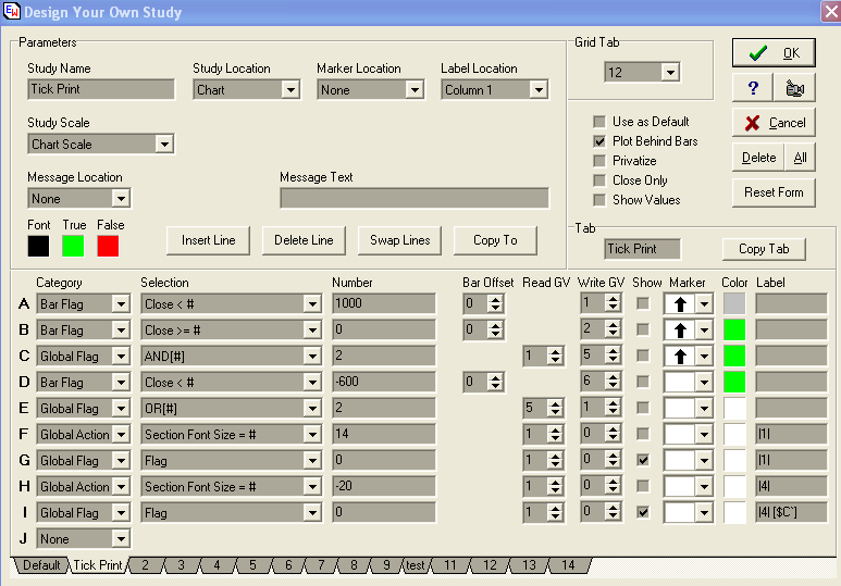
Lines A-C set the range for the “normal” green print. In this
case from 0 up to 999, with 1000 being the upper threshold for the red flash.
Line D sets the lower threshold for the green flash. You will also get a color
change (flash) when the tick crosses from below to above zero and vice-verse.
Line E generalizes the green print and sets the true/false flag into global
variable 1. If the flag is true you get green, if false then red.
The true/false color choice is controlled by the true/false boxes below the “Message Location” which is normally used to select the section where the message is placed. However, you will see it is set to “none”. The section locations are in fact controlled by the |x| command in Lines G and I.
Line F sets the font section in section 1 (the |1| command in the label directs the Global Action result to section 1). Similarly the |1| command in Line G label prints the rest of the label in section 1 colored according to the result of the Global Flag operation.
Line G’s complete label is “|1| Tick”. The spaces after the |1| and before the text serve to extend the message beyond the normal section boundaries, in the process hiding from view sections 2 and 3. By choosing the correct number of spaces you can align the text horizontally as you require.
Line H sets the font size for section 4, with a negative font size printing
as bold. Line I label command |4| tells Ensign to print in section 4 the remainder
of the label colored according to the Global Flag result. [$C`] is code to
print the current close as an integer.
Line I also uses spaces after the [$C`] to extend the size of the message
section and, in this instance has the effect of blocking out sections 5-7.
The only thing remaining is to print on the chart the key levels I am interested in ...
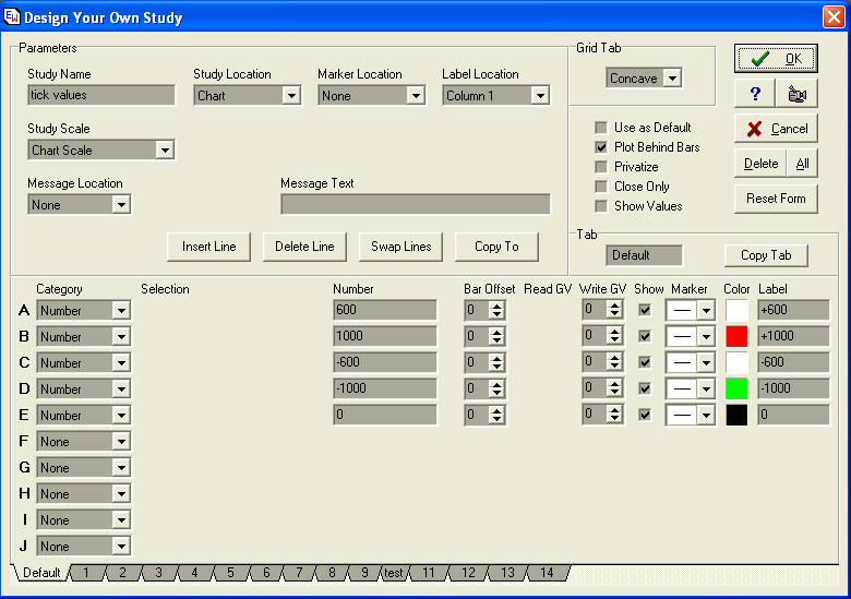
However you should note that Howard recommends using the Daily Price Line feature for this, rather than a dyo, as it is more efficient.
The one thing you need to do to if you print the “Tick” text is to “tune” the number of spaces that you need to centre it. How many you need depends upon the physical size of your chart. What I recommend is to make your chart the size that you want. Then adjust the number of spaces in Line G label so that the text is printed just to the left the tick value.
The number of spaces after the [$C`] in line I is less critical. Just make sure that there are enough to block out sections 5-7 on your chart.
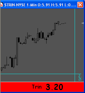
I use a similar process to print a big Trin value in red if Trin is greater than 1, otherwise green.
The dyo for this is ..
And that’s it.
Hope it helps.
Sniffy